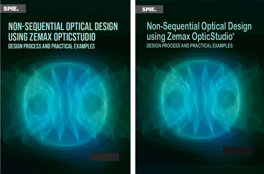
我选了右边那个,因为1 我英文差,全大写的文字读起来吃力。 2 我老眼昏花,喜欢清晰点的字体。那图不是艺术绘图,而是计算出来的一个真实光场分布,我觉得蛮有趣的,所以选作封面,现在似乎流行冷色调。这书是目前市场上唯一专门讨论这个题目的书,LinkedIn上已经有一批人在等待出版了。
我选了右边那个,因为1 我英文差,全大写的文字读起来吃力。 2 我老眼昏花,喜欢清晰点的字体。那图不是艺术绘图,而是计算出来的一个真实光场分布,我觉得蛮有趣的,所以选作封面,现在似乎流行冷色调。这书是目前市场上唯一专门讨论这个题目的书,LinkedIn上已经有一批人在等待出版了。
Between the two covers, the right one is more eye-catching.
Here’s why:
Right: Uses normal capitalization and spacing: “Non-Sequential Optical Design using Zemax OpticStudio.”
Left: ALL CAPS makes it feel dense and harder to scan.
Readers usually process title-case text faster than full uppercase, especially for longer titles.
Right: The title lines are spaced more naturally and feel lighter.
Left: The stacked ALL CAPS blocks make the top feel heavy and crowded.
Right: Looks more like a modern technical or academic book cover.
Left: Feels slightly dated because of the heavy uppercase style.
If someone sees the book as a small thumbnail (Amazon, website, conference catalog):
The right version remains readable
The left version becomes a dense block of text
你用AI分析啦。
我用我的肉眼也觉得右边这个好些。
看来这是 人-机 一致的结论
是的,左边的更有艺术感。右边的看起来容易。选右边的。
🤝🤝
我也喜欢2.
真都有共识
也觉得第二个看着柔和点
都和我看法一样。
我选右边。不喜欢全部大写的封面。
和我看法一样